Improving Shopify Email sidebar hierarchy
TL;DR
Three new editing options were being added to Shopify Email, targeting users new to email marketing, who might lack the resources for advanced editing power tools, such as Photoshop. Our goal was to improve the aesthetic appeal of emails sent through Shopify Email, and as a result, improve conversions.
What shipped:
Three new sections, with new sidebars and labels (microcopy)
A redesigned section picker and sidebar hierarchy (IA)
An updated error framework
Context
Shopify Email had launched one year prior. Moving into year two, the focus was on feature parity, and increasing the total addressable market (TAM) by beginning to address the needs of more advanced users.
We identified three new sections that would greatly benefit our users:
Multicolumn
Image Banner
Image with text
Concept definition
Originally, the team had bundled these together under the concept and term “layouts”.
I was asked to help with labeling and terminology. As I explored content, I ran a workshop to help with naming and definition, and it became clear to me that we actually had a concept problem— lack of clarity and alignment on what “layouts” actually were, leading to a hierarchy issue.

Other sections were surfaced individually in the section picker, but the three sections making up “layouts” were bundled together. This put the three new sections at a second level in the hierarchy. How might we make it clear to users what these sections were, and make them easier to access and adopt?
Terminology
Concept definition eventually lead us back to terminology. Rather than defining the term “layouts”, I realized that “layouts” were in fact conceptually sections, just a new type of section — complex sections, made up of multiple elements.

Internal language impacts the way we design conceptually and later the user facing content, so I keep both a user facing and internal glossary. In this case, the what not to use column came in handy!
Sidebar hierarchy (IA)
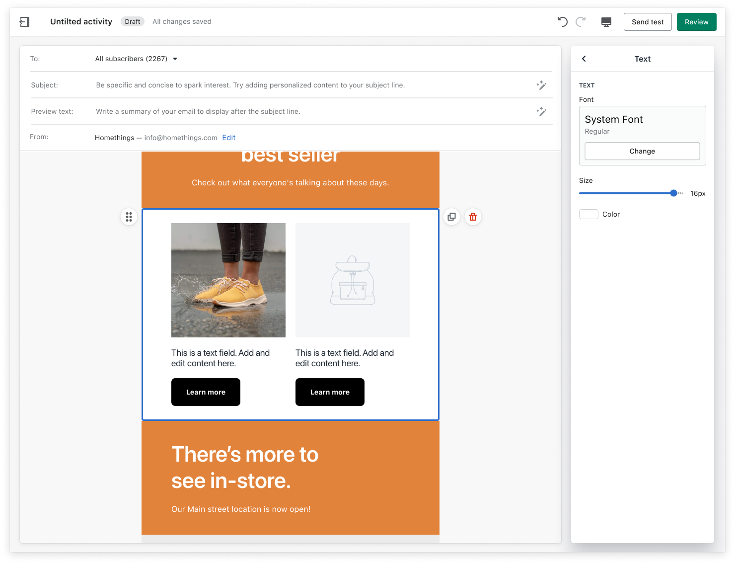
The editor consists of in-line and sidebar editing options and the previous sidebar hierarchy didn’t scale to sections with multiple elements.
I began content modeling, looking at sensical content groupings and flows, to redesign our sidebar information architecture (IA) with a content-first approach.
My design partner and I worked closely together to imagine these content findings in the UI, and in the context of our product and design system, and the visual and design constraints we were facing.
We stress tested our new hierarchy against all of our existing sections, and imagined how we might scale it to future sections. Many iterations didn’t make it pass the stress test, but we took our preferred approach to design reviews. After two design reviews with UX leadership, multiple content and design critiques, and pairing sessions with our project team to make sure our approach was technically sound, we had our new sidebars.
The updated hierarchy flows from:
The resource (main use case for the section)
Content attached to the resource (often text, button, and image)
Section level settings, which start with style, position, and spacing of the section, moving into the settings that impact the section the most but are edited the least, such as alignment and background color.
We moved content specific settings into the sub-menu to be closer to the content you’re editing. For instance, this gave us an opportunity to surface the alt text field with the image in a streamlined menu, and promote the use of alt text — which did increase in usage!
Sidebar labels
Our labels were made more precise and concise with a new approach to labeling. This approach takes into consideration accessibility, internationalization (right to left languages in particular for multicolumn), and pre-existing mental models both within Shopify and the wider world of email marketing and marketing design tools.
Here’s an example from Multicolumn:


Less is more when it comes to microcopy at Shopify. The focus is on thoughtful, consistent interface content that’s short and actionable, and easy to read and understand for a reading level of around Grade 7.
Section picker hierarchy
Sometimes you can’t ship the perfect solution. We began explorations into a section picker that could scale long-term, but faced time constraints, and needed to find a middle-term strategy.
The section picker was instead re-ordered from simple to complex. This serves as an indicator, along with the naming conventions, to signal that these are complex sections, without surfacing unnecessary cognitive overhead.
Each complex section is surfaced individually, at the same level as other sections, rather than secondary in the hierarchy.
A content design win was actually removing an unnecessary label in the section picker, rather than adding additional labels, and visual differentiators to showcase these new sections.
We documented a scaling strategy, with a strategy to revisit at our break point, which would be three new sections after our three sections shipped. As we had no plans in that year’s roadmap to add new sections, we felt comfortable to ship this section picker, and revisit in the future.
Before

After

Clear and actionable content
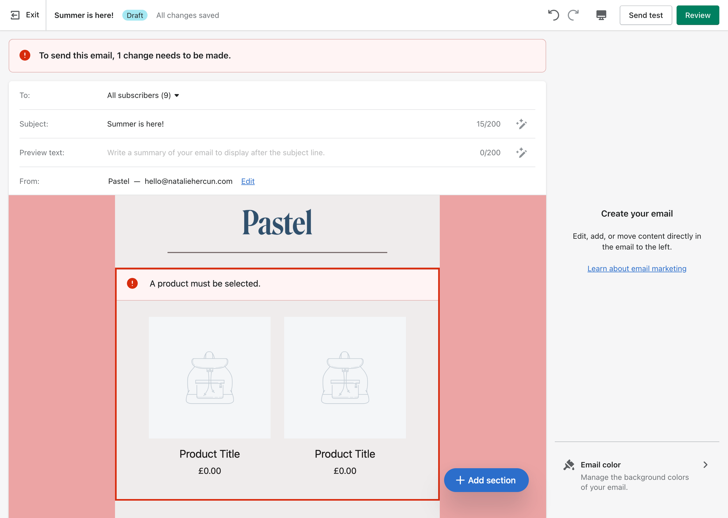
Thinking about the end to end experience and edge cases also led us to revisit our error strategy, as these sections introduced the potential for more errors and complexity. Before, a banner would appear at the top of the editor, as well as in-line errors:

You can have up to 20 sections in an email, and multiple errors per complex section, so users might need to click into many sections, and scroll their email for a while before finding the error.
After, errors were more clear and actionable by sharing exactly what action a user needs to take, and how many times.

Takeaways
When I joined this project, I focused on the microcopy and labels that I was tasked with, and spun on these for longer than I would now if I were to do this project again. Now I know to listen to that nagging feeling in my gut that shows up when I can’t find the right label to express a concept — it’s usually the sign of a deeper problem.
Content design goes so much deeper than the copy, and partnering with product design on the entire end to end experience, the flow, the narrative, and the structure is often the trick to concise, clear microcopy. Once I took two steps back from the naming conventions, and focused on the concept definition and the hierarchy, the labels became so much sharper, but the project and ultimately our users benefited from a clearer and easier to use end to end experience.
Thanks to Laura Forbes for being an amazing design partner on this project (and many others!)