Redesign email limits
Redesign the Shopify Email limits experience to empower more email sends and reduce user frustrations.
What and why
To prevent phishing campaigns, deliverability issues, and other incidents, there’s limits placed on how many emails can be sent out at one time with Shopify Email.
These limits were a major source of user frustration, confusion, support tickets, and complaints.
Because of how email limits were communicated, our users felt very restricted, and were often abandoning email campaigns and sending far less email than they actually could.
With a new pricing model launching, it was the perfect time to revisit our email limits experience.
Goals
Empower more email sends
Reduce user frustration / barriers to usage
Scope
Redesign review page
Audit and rewrite all related content
Update actual email limits
Highlights
Lead content, wrote all microcopy
Content audit
Content hierarchy
Redesign email limits experience
Update navigation/IA
Lead comms strategy, open PRs, and ship announcement
Before and after
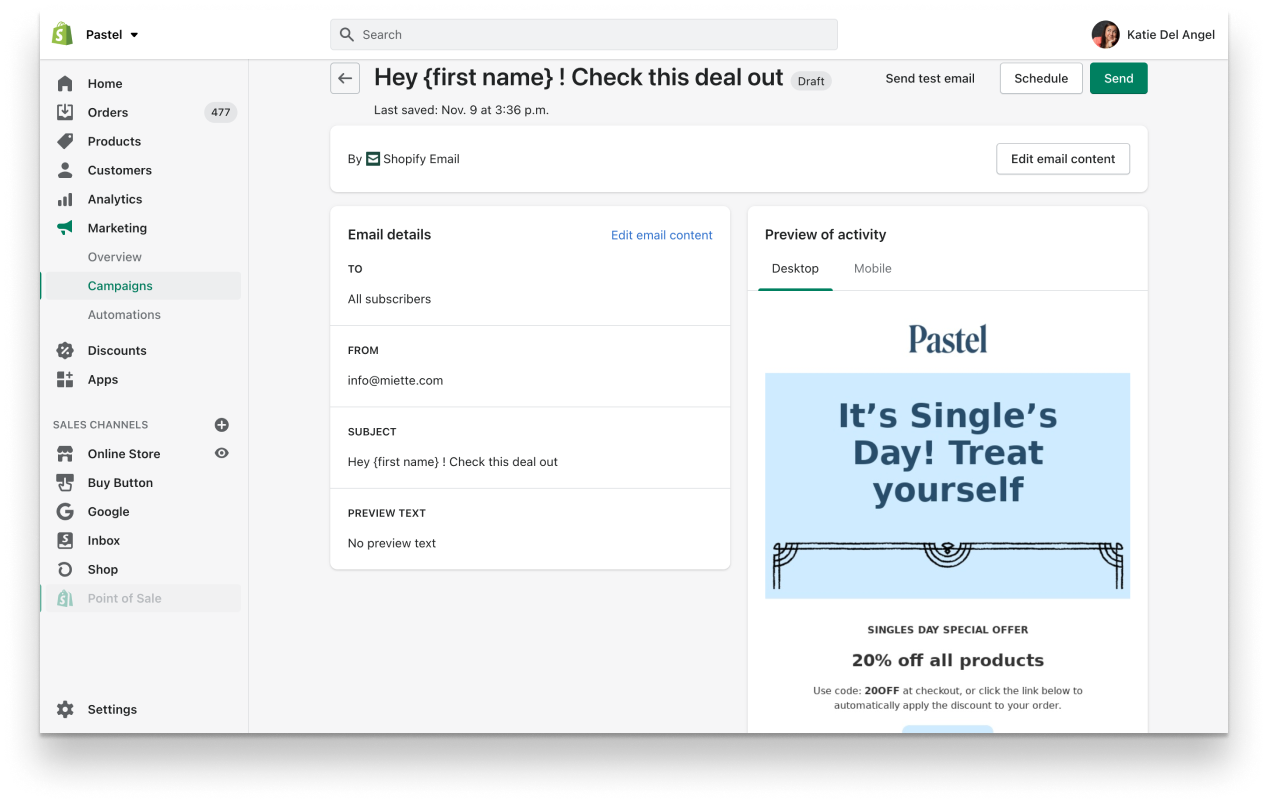
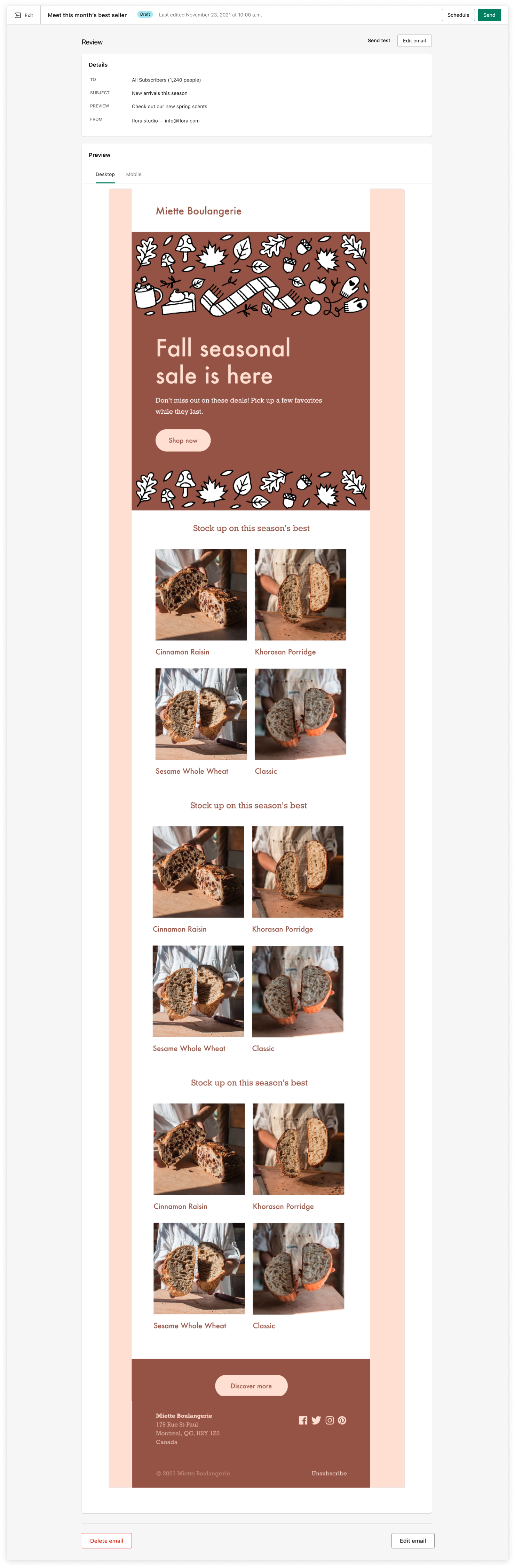
Now, Shopify Email has a brand-new review page, with an emphasis on reviewing and sending email.
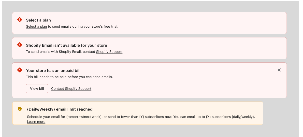
If a user hits a limit, the message is clear, understandable, and actionable. We only use two components aligned with our current design patterns, and only surface these limits on two pages where it makes sense for the user, rather than spread out across all points of the email journey - keeping users focused on the primary goal of editing, reviewing, and sending their messages to their customers!

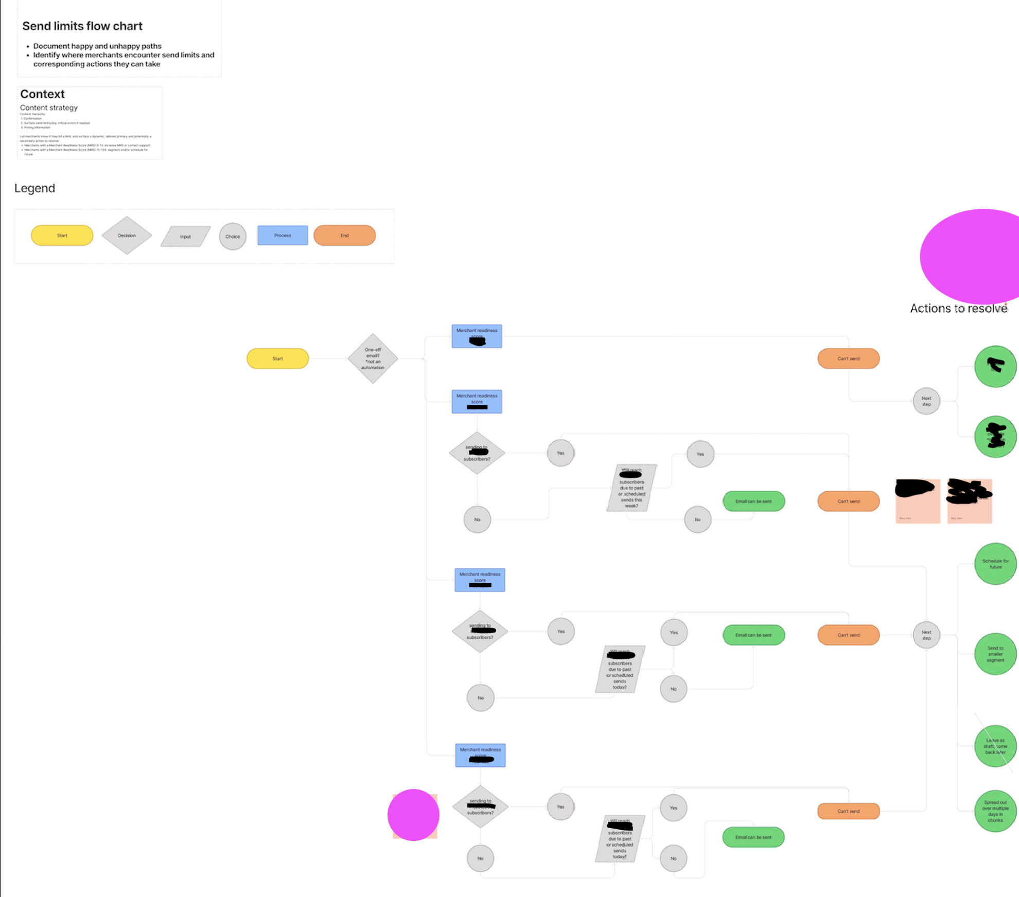
Diagram
Clear and concise content starts with with a clear strategy. It’s imperative that we know what we have to communicate, before we can decide on the medium or the message.
The team knew that we wanted to improve our email limits, but I sensed a lack of clarity and alignment about our current and proposed limits.
As a big Abby Covert fan, my first instinct is to make sense of the mess by diagramming.
To facilitate decision making on the updated email limits, I paired with engineering and data to gather context, and put together this flow chart to illustrate the email limits experience. All of our stakeholders were able to come collaborate in this Figjam during working sessions and understand the current limits, and the proposed limits and resolutions.
End result? I facilitated decision making on greatly increased email limits, which also made sure that less than .25% of users would ever truly face an end point that didn’t have an accompanying resolution.

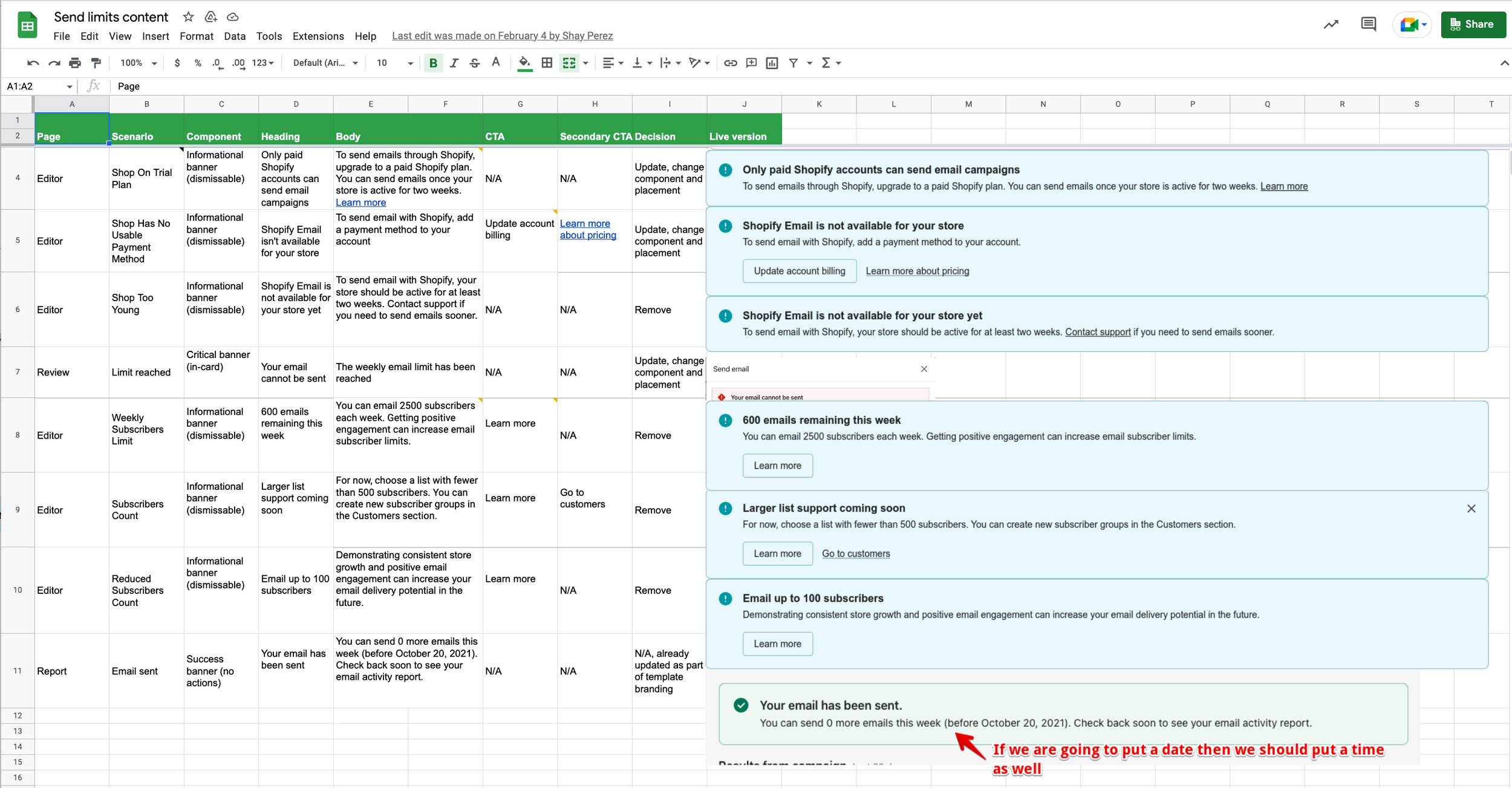
Content audit
I created a content audit, using Storybook and Google Sheets, to assess:
Where in the user journey email limits were communicated
How email limits were communicated (what component/medium)
Copy audit for style, clarity, consistency, and voice and tone
Consistency across messaging, as well as patterns and language in our design system
Technical accuracy
Were all of these messages still relevant?
After the audit, I identified a number of improvements to make, including:
Surfacing email limits content only when timely, actionable, and useful - moving to a reactive rather than proactive model
Changing where in the journey and which components were used to surface email limits
Rewriting the content in clear, active, actionable language, with a focus on calls to action to empower sends
I also updated the previous term ‘send limits’ which wasn’t understood by our users, and hadn’t been defined or understood internally. I updated the term and definition in our glossary and gave guidance on always communicating the limit itself in terms of subscribers, which was more in line with our user’s mental model and the language they used to describe the limit.
Content hierarchy
As we redesigned the review page, I also created a content hierarchy, and identified an issue with our navigation linked to our information architecture, and the underlying technical infrastructure our app was built on.
The old experience had a back button that didn’t take you back to the email editor which was the previous step in the flow, but actually kicked the user into the Marketing > Campaigns section of the admin. This is one of the doors that leads users into Shopify Email, but was three steps back in the actual flow.
Now, users have both an emergency exit, and the ability to go back to the email editor if they review their email and find that they need to make a change. Because Shopify Email is now an overlay in which users can’t access the main admin navigation, we decided on exit instead of a back button at all.
What I did and how I did it
I also wrote all of the microcopy on this project - from buttons, to banners, help text, and more - and designed our related launch announcement.

Outcome
After many codesign sessions, crits, reviews, and feedback and pairing sessions with our project team, we shipped!
I’m proud to share that we greatly reduced user frustration and confusion, significantly reduced support tickets and complaints, and surpassed our goals for the project.
Takeways
Updating an existing design based on user frustrations doesn’t have the cachet of a new product launch, but I think that this project shows the power of content design, and also how important it is to prioritize “UX debt” to maintain a high-quality product.